top of page
  • Writer's pictureJacob Martins

Updated: Apr 26, 2022


Location Recce


Recces are important to scout out potential areas for filming. It's not helpful to choose a filming site and later find it's unusable due to problems with sound, terrain or other unknown issues.

Recces are therefore essential, to maintain order during set and make sure everything goes according to schedule. If you already know potential problems, you can prepare for them and be ready in case something goes wrong.


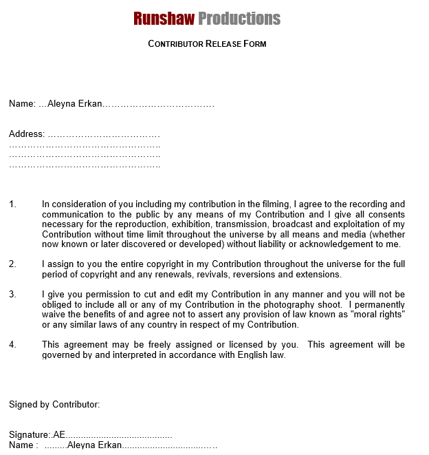
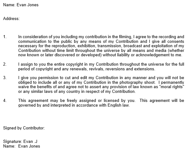
Contributor Release Forms


This is important to make sure the actors agree with their footage being edited and used. Without their permission it'd be illegal to use the footage.


Call Sheet


Call sheets are extremely important on set if you need to find where someone is located. We can also organise our time and keep on schedule.

7 views
  • Writer's pictureJacob Martins

Updated: May 16, 2022


Final Poster


Progress Screenshots


At first, I really struggled when searching for glass pieces I could use for my project. Once I found them, I tried a few different ways to cut them from their template, therefore you might see minor changes in the progress reports. After being satisfied, I added a blue tint to the glass to further match the division between the red and blue hues.

For the main image, I enhanced each individual color, turning the pinks into more of a red shade and slightly altering the blues. I touched on the magentas but, I had created too many hue/color balance layers at that point to be able to work with it. I even tried merging the layers but to no avail. I then decided to content-aware fill the missing piece, at the bottom, instead of enlarging or moving the image. I added more blood to the knife, as well.

I then located a font I liked for this project and placed it on the left after looking at existing Netflix posters of the genre.

I altered the temporary background and brought back the original background of the image, slightly enlarging it. I added a bit of smoke using brushes; Looking back, I probably should've pushed more on the red/blue divide. Nonetheless, I like how the blue creeps into the red side suggesting it's somehow taking over.

After that, I once again focused on the fonts. I found Netflix often uses sans-serif fonts in their posters, so that's what I chose. I procured a logo. And finally, I added the heading.


16/05/2022

I realised I could easily fix this issue by making the picture black and white, and then adding the respective colors. The contrast between the 2 colors is stronger, making it stand out more. The blue smoke is gone, which I liked but nonetheless, it doesn't contribute to the contrast. I haven't found a poster where the Netflix logo isn't red, so it will have to remain slightly hidden.

In my research for a logo that wasn't red I've realised most companies use red for their logos.

I later decided to bring back the blue from the previous final poster.

16 views
  • Writer's pictureJacob Martins

Updated: Apr 27, 2022


As a group, we worked together to create a rough storyboard on sticky notes. 2 of the members drew the pictures whilst the others gave ideas or moved the sticky notes around. 1 of the storyboard artists is now transforming our rough work into a proper storyboard.


Overall, I found this to be an essential step in the storyboarding process; it allowed us to discuss ideas relating to the plot and to discuss the order of the scenes. Our final storyboard will be neater, and therefore clearer, due to this initial work.


Here are the fisnished storyboards. They will ease the filming process.


Script:

I worked on the script, after looking at the storyboards. It took me around 3 hours to complete.


The synopsis was done in parallel with the script. It adheres more to Tracey's original story, however we cannot replicate some of the scenes in the synopsis. Due to this, minor inconsistencies are seen between the script and the synopsis.


27 views
bottom of page