- Jacob Martins

- Jun 6, 2022
Updated: Jun 14, 2022
Audience


Primary research is a direct collection of data. This can be done by creating surveys, scheduling interviews, etc. It is highly efficient to collect data for your specific needs, however it can sometimes be cost ineffective.
I wasn't completely satisfied with how the results from my questions were so scattered. For example, one of the questions asked about age. This was poorly formulated as the answers weren't organised into a chart and were instead stand alone answers. On future projects, to solve this issue, I'd consider condensing my questions and make them broader. Asking about each person's generation might be a good solution. If I don't have a way to organise more personal answers it could get chaotic as the number of answers increases. I think my questions were for the most part pretty general, aside from the last one which was specific to my current project. In this research I had a mix between quantitative and qualitative data. The pie chart is an example of quantitative data while the other 2 questions are qualitative. They are qualitative because the user has to give their opinion through a rating.

The process of finding existing data collected by others is called secondary research. This is extremely helpful because it gives you details it'd be hard to otherwise acquire.
With my original research, I chose a different genre to the one we ended up producing. I chose a drama/mystery for my audience task. This was a secondary internet research task which allowed me to develop research skills, so although it was unrelated to my horror/documentary project, I still think it was one of the best tasks I've worked on. This could be due to the fact it's a genre I am passionate about. The narrative chosen was quite gruesome, this meant I had to overcome some aspects regarding the horrific crime scene we were presented with.
For future projects, I would make sure to choose a genre correlating with the project I'll be working on. This would immensely help the production stage of the project as I would be familiar with the codes and conventions of the genre.

Mock-ups are important to get a general idea of what you'll be creating later on. They can be referenced and worked upon to improve the final piece. This mock-up helped me develop skills in layering images and gave me an opportunity to experiment with filters. I constantly used the filter camera raw gallery to enhance photos.
I created this mock-up when I was still unsure what to do for my project. Compared to the final project, I really enjoy how muted the colours are. I later realised something should look good regardless of colour. Colour should enhance an image, not be its main factor.
The main aspect I took from this mock-up was the font colour. Looking at this poster reminded me of the gruesome crime, which was quite traumatising. That fact explains why I decided to go in a different direction with my poster. In retrospection, I think this poster better fits the genre as it follows the codes and conventions of a true documentary.


Feedback is of utter importance as it allows you to improve your projects and create something you are proud of. Feedback from teachers helped me review my thought process which gave me the ability to correct my mistakes. Feedback from students gave me new insight on parts I had overlooked. Both their feedback gave me the ability to put things into perspective and change my work from mediocre to something I should be proud of.
Planning/Research

This proposal was the original idea for what I wanted the project to look like. The film trailer was completed as the group task. I opted for the poster instead of a magazine article, as an article wouldn't work with what I had envisioned. Even though the trailer included stabbing, it can still fit the BBFC 15 criteria. All my posters included a maroon colour which is quite connotative of dried blood.

For my trailer I did indeed use montage editing, meaning the continuity of the clips were not in chronological order. My trailer starts with Tracey overlooking the dead body of Edward, which after an intro screen, is followed by their encounter. Soon after, you see her stabbing the body which leads her to be imprisoned.

At the time I was heavily inspired by crime scene shows. They were rather inadequate once we started production. The shows were police based rather than murder based so I soon abandoned them and instead researched the crime we would be recreating. After better understanding the situation from multiple points of view I gained my own perspective towards the crime. I was even able to find pictures of the decapitated head still attached to the body.

I further developed skills in post and pre-production however, whilst out on location I did not use the video camera which was a lost opportunity, and I will hopefully develop these skill next year. I improved my Photoshop skills, Audition skills and team working skills as well as my ability to find relevant information from multiple sources.

The first few weeks were quite busy. Everything from week 1 was successfully completed without any issues. Week 2 was completed but, I only started work on the mood board in week 3, and I only scratched the surface researching Tracey. Other than that, everything was done without problems. I collected images of Tracey and of the crime scene and roughly connected them in Photoshop.

In week 3 I collected primary data regarding Netflix. While waiting for the results I continued work on the mock-up and started work on the mood board. I looked at multiple existing posters and used them to finish the mood board. We were also given tasks to research Netflix as a company.
Week 4 was when I began work on the poster. With our groups we went and took photos out on location that could be used for our posters and promotional tasks. I dropped the mock-up and started compiling the new images. We also had a lesson on brushes and fonts.
-

We did not have a shot list; we instead used the storyboards as guidance. Week 5 was also when I did further research into the crime and found a lot of evidence. Each member was delegated a task; mine was to write a script that could be used for the actors. I finished work on the poster.
Week 6 was when we filmed. On Monday we assigned job roles. Tuesday and Wednesday we completed shooting. Even though we planned what to do, I don't think we got enough footage. If we we were to do this task again I would like to further develop the story which would expand the narrative; this would allow a variety of different characters and scenarios to be developed. Editing started this week.
-

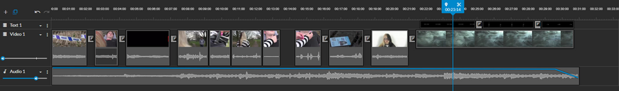
Week 7 was post-production editing. I took a while to edit my trailer as I spent a few hours reviewing and editing footage that ended up not being used. The reason I cut the night club scene was because it didn't fit my trailer concept. However, not all was wasted as this footage allowed me to gain skills in Adobe Premiere. This setback meant I received my peer feedback much later.
In week 8 we started researching press kits. I delved into a franchise I didn't know much about and found a lot of information. This gave me the press kit I'd later use as inspiration as I was really fond of the layout. This press kit is from a movie of the same name as Stranger Things; this movie is completely unrelated to the series.
Week 9 was the continuation of the research into press kits, it was also the beginning of our own press kits. We had a few lessons where we planned it. This week I also chose to expand the synopsis to better fit my vision.
-
-

In weeks 10 and 11 we continued working on our press kits. In week 10 we took pictures of the cast and crew. We went out as a class with our teacher on location with all of the media kit and props. We photographed us working as a production crew. I quite enjoyed this part.
In week 11 we worked on some social media posts.
Week 12 I was absent.
-

Weeks 13 and 14 were the creation of this product. Review and editing of older posts.


The mood board on the left was an immense inspiration when working on the mock. I didn't use it when I discontinued development on the mock as I wanted to go in a different direction with my poster. The images unsettled me so I used the posters on the right as a second mood board. Some of the posters on the right were shown in a lesson, when I saw them I immediately knew I wanted shattered glass separating the killer's face.


The storyboards were constantly used. They were helpful when formulating the script, on-set, and even in post-production. They were the first step we took when trying to decide the story. The use of the post it notes enabled the team to discuss ideas for shots and they were easy to reorganise.
I liked the use of post-it notes but looking back, I don't think the majority of them should've been drawings. Instead, each of us should've written a couple sentences and with those plot points someone should've been in charge of writing a synopsis, which would then be altered by the other members. Once the story had a strong foundation then, work on the storyboards could be started.


This is part of the script and the synopsis we worked with when creating the trailer. They weren't used on the day of production as the director decided to only work with the storyboards as guidance.

Although an essential list, we didn't use half of the props we were planning to. The smoking scene was axed, we ended up not using socks and the prison scene wasn't expanded upon.
Production Skills


I think my final poster on the right is too colorful for my genre, so here I am also presenting my pre-final poster on the left. I produced these in Photoshop and layered each individual piece of glass to create the divide between the red and blue. It demonstrates the killer's multiple personalities and their shattered mindset. The connotation of red signifies danger and horror and could be warning to her personalities.
My trailer feels slightly lacklustre. I agree with the peer feedback that there is no concrete storyline presented to the audience. I kept it vague so the audience would hopefully want to know what might happen in the movie. This is an enigma code. The lack of voice overs makes it feel somewhat empty. Looking back, I could've added more text screens to remedy this problem. Voice overs are generally a code and convention of trailers. If I were to do this again, I would make plans to record a voice over.

My press kit was heavily influenced by older press kits. When I was doing research into Stranger Things, I stumbled across this press kit; I immediately knew this is what I wanted my kit to look like.
I found it quite hard to come up with bios for each individual cast & crew member. If I was to do a project like this again it would be useful if each person wrote an autobiography.
Development of Skills


I have improved my skills in Adobe Photoshop, Adobe Audition, Adobe Premiere and WeVideo. In these, I've learned how to edit photos, sound, and video.
I have improved my team working skills and research skills.
I've acquired multiple websites to find resources for future projects: Sound Libraries, Stock Images, Fonts, Brushes, etc.
"What would you do differently next time if you had the opportunity to produce the project again?"
If I were to do this project again I would make sure every member in the project is in agreement from the start. This would clear any confusion regarding job roles, genres, storylines, etc.
Overall, I really enjoyed working on this project, even if at times I was frustrated by my work. In these last few days I have discovered my passion towards media and I know it's a topic I'd like to further pursue. However, this won't be possible due to certain circumstances. I do hope I get a chance to continue studying media but until then I would like to do independent work and create my own projects.


